A redesign of Remitbee’s mobile application to increase trust, creditability, and conversion rate through improving user experience.
For this 8-week academic case study in the spring of 2022, I teamed up with Dennis Limbo, Kayla Wu, Cassandra Graves, and Morgan Emsley. Our client, Remitbee, founded in 2015, is a startup company providing online money transfer and currency exchange services based in Mississauga, Ontario. I worked on defining project direction, synthesizing research data, and translating findings into the redesign. At the end of the project, I conducted A/B testing on my own to compare the existing flow with the redesign.
Understanding Business Objectives
After meeting with the company co-founder, we learned that the company is in the growth phase where they are focusing on efforts to increase its conversion rate for the mobile application. Understanding the business goal led us to our initial framing: How might we increase the conversion rate by improving new users’ first impressions of the Remitbee application?
Learning about Users’ First Impressions
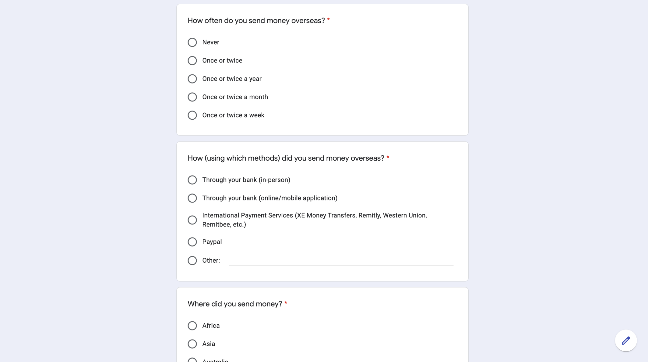
During initial research, my teammates and I interviewed eight participants who have performed international money transfers but with no prior experience using the Remitbee application. The objective of the interview sessions was to understand participants’ general practices around sending money overseas and their first impression of the Remitbee application. We used a pre-interview questionnaire, a semi-structured interview, and a comparative analysis for each session.
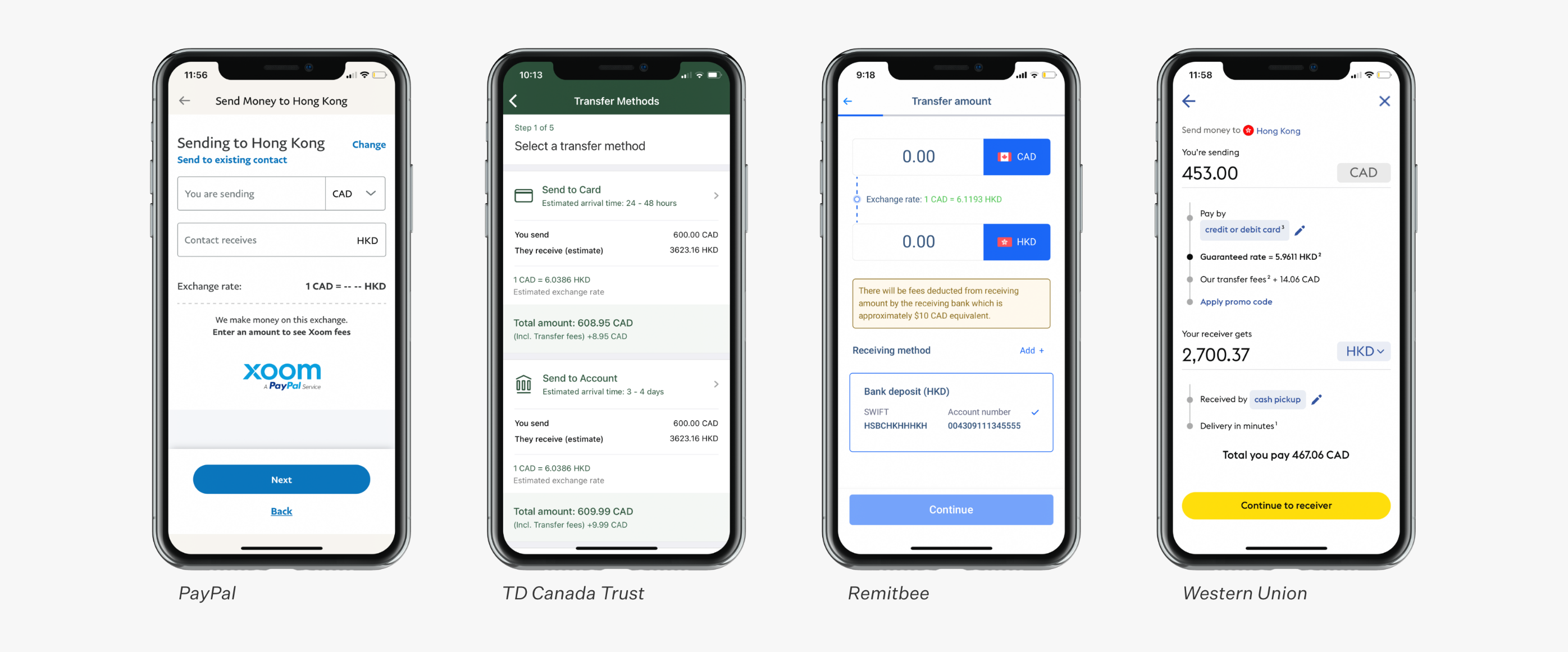
We guided participants to complete the main user task flow — send an international money transfer on Remitbee’s mobile application and three other interfaces for comparative analysis. In the post-task interviews, we asked the participants to compare their experience between the applications, their preferences, their first impressions of the Remitbee app, and factors that helped them determine trustworthiness.
What Factors Influence Trust?
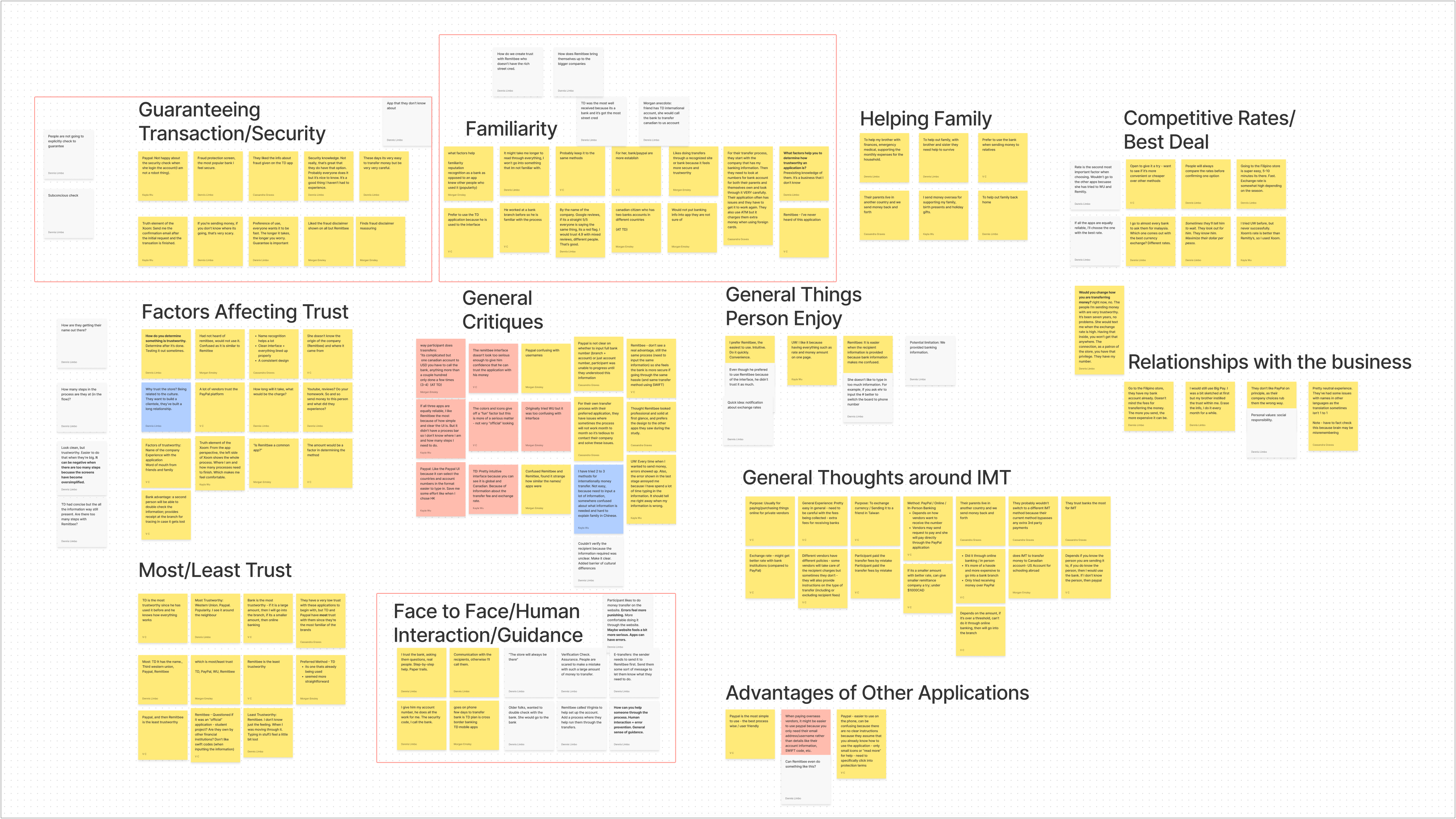
After conducting interviews, the team came together and used an affinity diagram to organize our research data. Half of the participants from our interviews reported that their method for sending money overseas is through their banks, either in-person or online banking. Besides familiarity, reputation, and creditability of financial institutions, these participants valued the human interactions as bank staff can provide guidance and reassurance through the process.
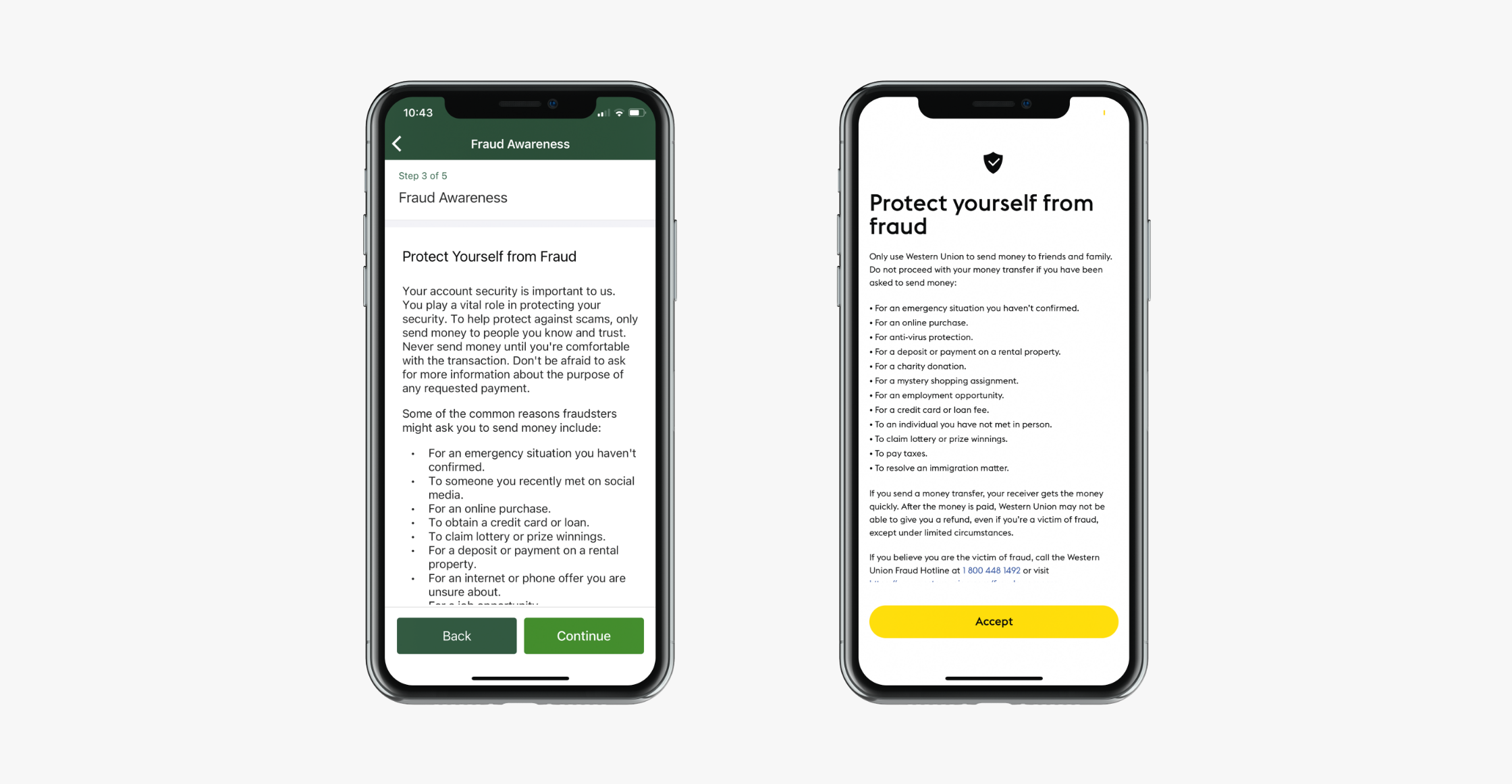
Multiple participants identified that the fraud awareness screens (as part of the transfer process) on TD Canada Trust and Western Union’s application helped increase their feelings of trust in the transaction. Even though participants noted they might not read it, they felt more secure knowing that the companies performed their due diligence to protect and remind users before sending money out.
With the new information from our research, we decide to reframe to: How might we help Remitbee build trust and creditability through the experience for users to feel more confident and secure when sending money over the mobile application? The scope of the redesign is the user flow and experience of the application rather than rebranding the company. Therefore, we followed Remitbee’s existing brand guidelines, including logos, typography, and colours.
Designing the Trust Factor
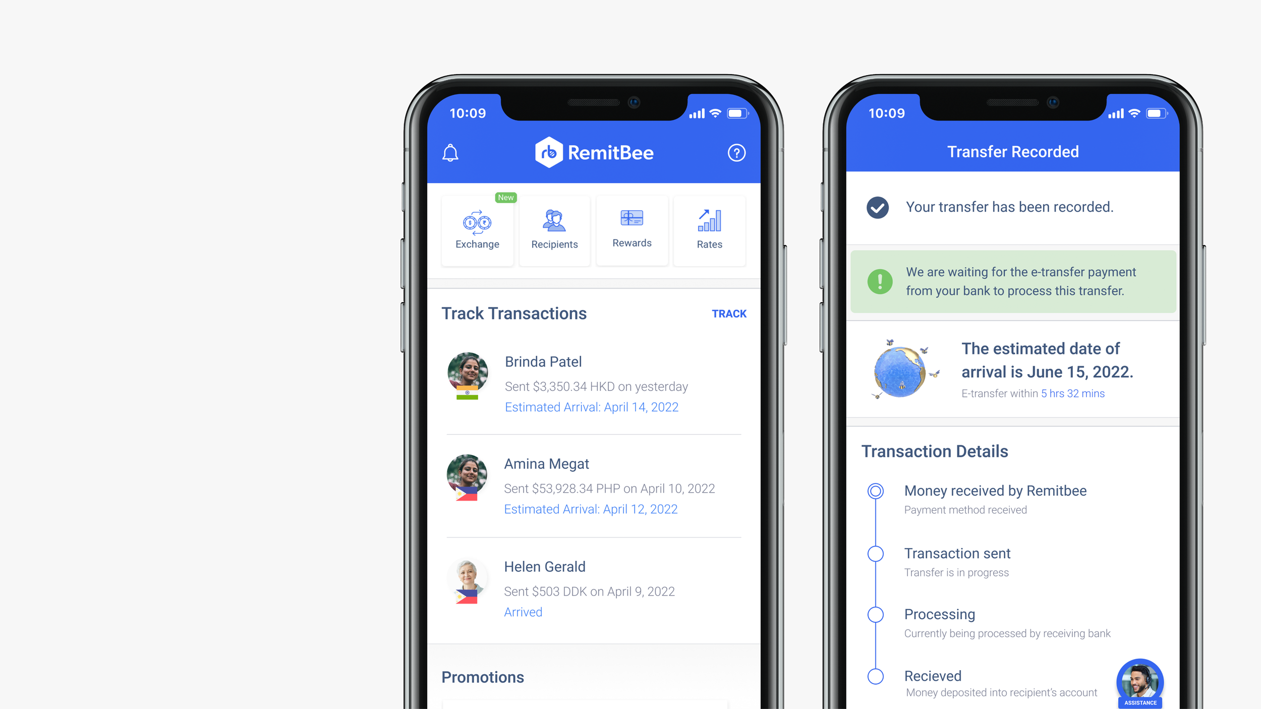
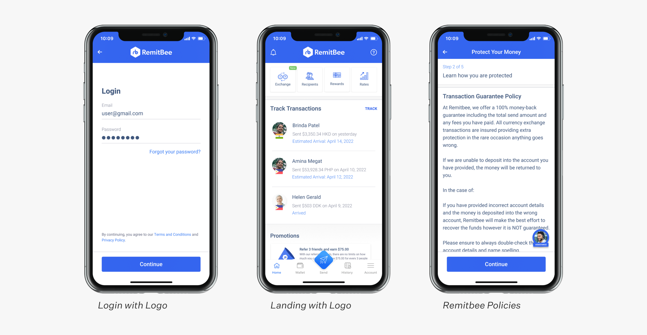
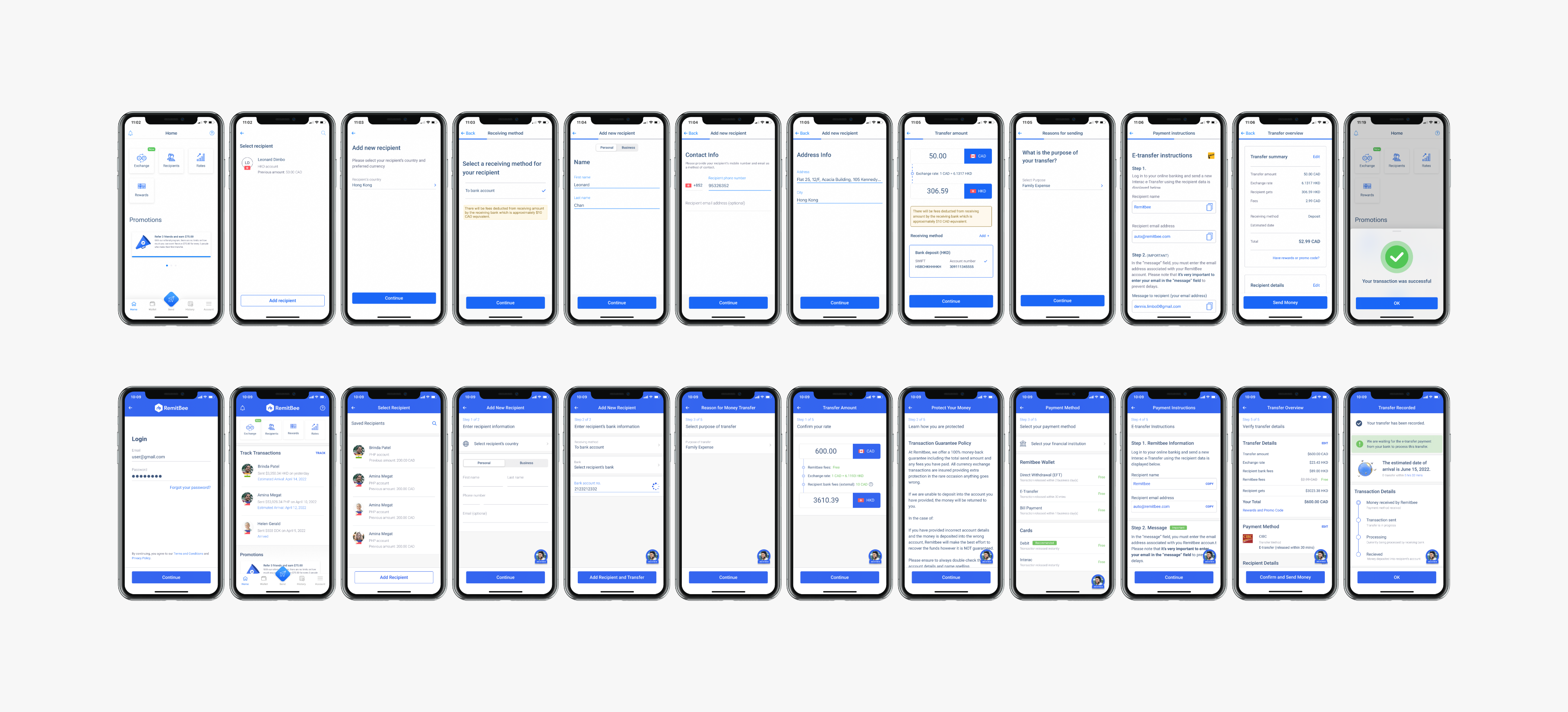
To strengthen their brand identity in the redesign, we inserted more instances of their logo throughout the application, on the login and landing screen, for example. To address participants’ preferences for the fraud awareness screen, we presented information on the company’s Transaction Guarantee Policy to foster a stronger feeling of security and confidence.
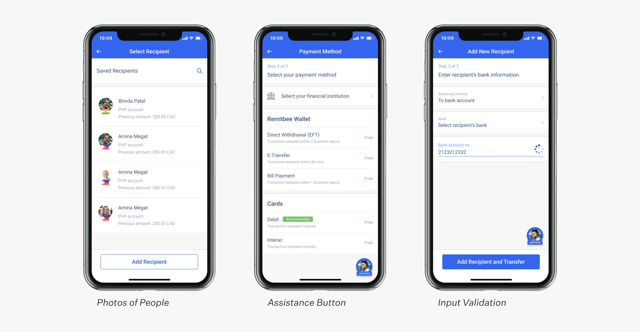
We replaced many animated graphics with photos of real people to instill a sense of human interaction within the application. For example, there is an assistant button with a picture of an operator at the bottom-right corner throughout the process to ensure users feel that they can obtain help whenever required. Besides convenient access to help, there is a field validator to help prevent errors, provide reassurance, and increase confidence for users that they are inputting the correct information.
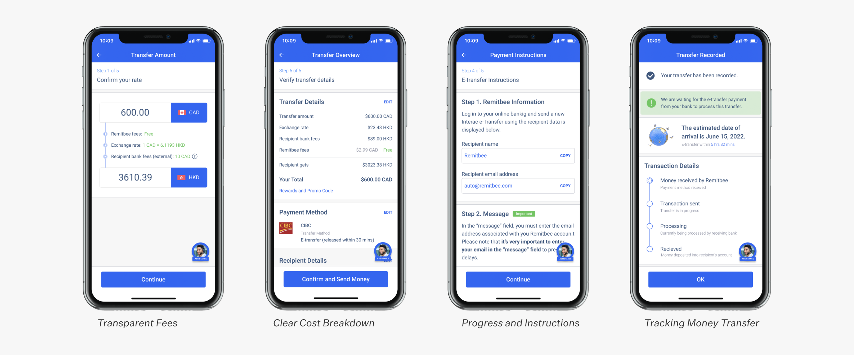
When dealing with international money transfers, users like to know the internal and external fees they should expect. Being transparent about pricing breakdown from the first step of the transfer process will help build trust. To improve the visibility of system status, we added a more detailed progress bar with instructions. Additionally, we included the estimated date of arrival and a visual timeline of the money transfer at the end of the transaction, similar to how users can use tracking information for a package in the mail.
Due to time restrictions of projects, the team didn’t get a chance to conduct user testing for the redesign. After the class ended, I decided to plan and execute A/B testing on my own to compare the existing interface with the redesign. The hypothesis for the experiment is that the redesign will improve users’ impression of Remitbee’s trustworthiness, their willingness to transact, and their risk perception. Similar to the interviews, I found a total of ten new participants with no prior experience with Remitbee.
Evaluating the Redesign
For more accuracy in the controlled experiment, I uploaded Remitbee’s existing screens so users would be conducting the tests for both interfaces in a similar setting — using Figma’s prototype tool. The order of the two versions is random for each test.
Upon completing the tasks for each interface, users filled out a post-task questionnaire consisting of a series of Likert scales. Referencing an academic article on Consumer Trust in an Internet Store: a Cross-Cultural Validation, I selected ten questions from the topics of Store Trustworthiness, Willingness to Buy, and Risk Perception and tweaked them for the context of the experiment.
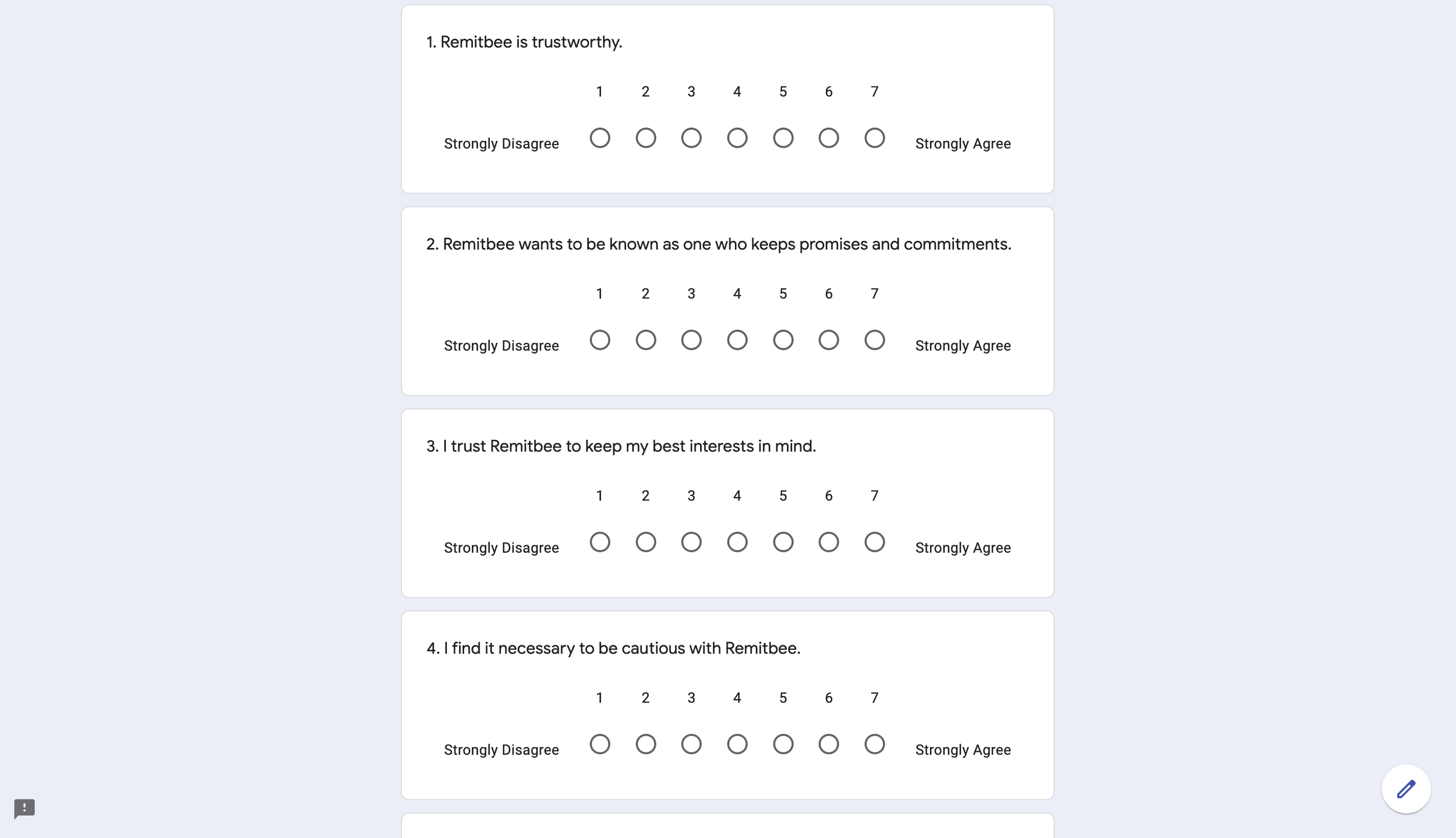
Based on the small sample size, results showed statistically significant differences in participants’ trustworthiness and risk perception rating when comparing the two interfaces. However, there was no statistically significant difference in participants’ willingness to transact through the Remitbee application. Improving participants’ trust and risk perception for the application did not lead to an increase in their likeliness to return and consider sending money through Remitbee for their next transfer.
Challenges and Reflections
Working on this project was my first attempt at turning the elusive and intangible feeling of trust into actionable and concrete designs. This project taught me that experience design does not have to focus solely on rectifying problems and pain points. We can also consider how we might add value by improving user perceptions.
From the early days of the project, we acknowledged that it was a challenge to tackle the topic of trust as instilling creditability and trust for a startup company goes beyond the product user interface and experience. Knowing that there was no “quick fix” to the problem, we used this as a formative learning experience because building trust is a crucial part of the long-term strategy for any digital product.